Eduardo Paolozzi – Screenprints


A selection of work from the late Scottish sculptor and artist Sir Eduardo Paolozzi (7 March 1924 – 22 April 2005).
Paolozzi has always been a favourite of mine, particularly his beautifully composed, ultra-vibrant graphic screenprints. This post was sparked when I recently picked up a copy of “Paolozzi” a 1999 paperback publication that gives a chronological overview of Eduardo’s work.
Here is the back page synopsis, note that I’ve embellished this slightly, altering present to past tense.
Eduardo Paolozzi (of Italian descent) was one of the major figures of postwar British art: A father of Pop Art a creator of key icons of the nuclear age, a brilliant manipulator of the images produced by the media, an iconoclast and traditionalist, an outsider and academican.
Onto the notes, I’ll keep it simple and won’t attempt a heavy analysis. If you would like to read more about Paolozzi, his methods, motivations and technique then the best place to start is his in-depth wikipedia page. One (patronising!) point I will make is when viewing, remember that all of these images hail from the 60’s or 70’s, long before the age of Photoshop. An obvious point for sure, but for me, something that underlines just how sophisticated and forward-leaning this work was at the time.
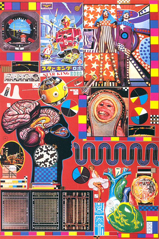
Top: “Hollywood Wax Museum from Zero Energy Experimental Pile (Z.E.E.P)” 1969-70 Screenprint on paper. We kick off here with a real trademark pieces, and I’m actually referring to the title, not just the artwork, every bit as out there! A real diverse mix of elements features here, Sputnik, attitude indicators, giant Mecha robots, Marylin Monroe and the uneasy focal point of a NASA space monkey (Sam?).
2nd top: ‘B.A.S.H‘ 1971 Screenprinted on paper. A flat colour, more geometric offering, this one gives clues as to Paolozzi’s background in surrealism.
3rd top: “Silken World of Michelangelo from Moonstrips Empire News” 1967 Screenprint on paper. Another great example of the way that Poalozzi used repeated patterns, to layer up compositions, at no point here does the eye rest easily. Also of note; the deconstructed Disney image worked down to mosaic form, something that appears in other screenprints.
4th top:“Print from Mein Kolner Dom: Blueprints for a New Museum” 1980-81lithograph and screenprint. Another playful and innovative composition; a giant blue bottle, Skylab (remember that?), Albert Einstein, jet packs and more, all playfully juxtaposed over the innards of a grand gothic cathedral.
5th top: “Part One, Frozen Terror… Part Two, Fangs of Death”1965 screen-print. Another fab title, this mixes familiar pattern geometrics with pin girls and a strange alien type crusader creature, printed with a typically vivid contrasting colour palette.
6th top: “Cover for a Journal” Screenprint. This more abstract piece features a slick example of overprinting.
7th top: “Why children commit suicide…read next month’s issue” Signed and numbered photolithograph 1965-70. Another crazy title!
8th top: A photo of the artist, taken at a Hamburg ship breakers yard in 1961.
***
Images scanned from ‘Paolozzi’ (Fiona Pearson 2006) buy it here: http://amzn.to/mwl61i

These are great, I’ve always been mildly aware of Paolozzi and been meaning to dip in further. These collages and his large scale mosaic work do feel like they’re preceding Photoshop and digital imagery. The borderline garish colours and refined cut and paste style of the first few bring to mind, to me, the more artier work of British comic artist Brendan McCarthy.
I find that monkey face deeply disturbing though.
awesome post. AWESOME BLOG. been looking for stuff like this forever! keep posting!
G’day, Sweet page. I am keen to read a lot more of your suff.
http://www.danaashlakoff.com/
I’ve been buying works by Sir Eduardo Paolozzi for about 6 yrs now. I first noticed his work in 1976, and have liked it ever since.
Between my partner and I we have two of the ‘Will Man Desert The Dog for the Dolphin’ series, one called ‘Franko Amsterd’, and one of the ‘BASH’ ones with a sky blue background. We love them all.